
In what ways does your media product use, develop or challenge forms and conventions of real media products?


This screen grab is taken from the the music video "Drake - Headlines" this is the iconic scenes within the music video, this frame shows a group of Drake's friends around a table, drinking wine and on a very luxurious looking background and props. We also in our music video used this technique to present our artist to be rich and successful and did the same thing.
One of the theories we used to assure we had features assured for a good pop music video is the direct contact with the main artist looking exactly in the camera. we also had a series of edits of the artist, we had angles of our artist, this was done as much to the beat, this is following Carole Vernails theory that music videos have more frequent edits on the beat.

Whilst planning out music video, we as a group decided we wanted to show the transition of our artist going through a street artist look to a very established rich look, however we took in consideration Andrew Goodwin's theory about lack of traditional narrative in pop music videos.

In the video "Drake - Forever", we used the scene where Lil wayne is rapping, however the whole scene is almost tinted in a red light, to grab attention and emphasise being almost like being in VIP club style atmosphere.


This is a shot of our artist playing pool. We tried to present power by him being the centre of attention just like Dolla in his music video.
My inspiration for my ancillary work from a range of artist and researching the connotations of fonts and colours which would give my artist the correct profile what we have created for him.

This is the drake "Take care" Album, drake is a rap artist, usually associated with his grand wealth, his celebrity rapper friends such as Lil wayne. This album has a colour scheme of gold and bronze, a sign of wealth and power. This is what I wanted to have on my album cover to have a similar effect. So took a similar approach on front colour.


Whilst looking for inspiration for my ancillary work (digipak), I wanted to do something innovative, and slightly different to what R&B album art formation would have, so I took inspiration from the "The hold steady" album art. I took the text formation on the back of the digipak. It allowed me to not destroy the actual background of the digipak by taking minimal space, and looking clutter free and it's different and this is how I challenged the convention of a R&B digipak format.

| This is my back panel, it obviously varies from my original plan, when doing the pitch to the class. I realised that many people where adding some kind of effects or visual effect to make it stand out, so I start playing around with this background adding and reducing tint, temperature and all the works. Then it came to me if I had almost had this panel effect added, so I changed the original background colour, and then copy pasted the original image on top, and divided them. |
And what this allowed me to do is follow some conventions such as keeping this Golden outline which connotes a sense of wealth and quality which I want to be associated with my artist, this is what drake done. I also wanted the visual effects and the bright city to grab the attention rather than the artists face, to promote the kind of music he would be playing and the kind of character he is from first glance.
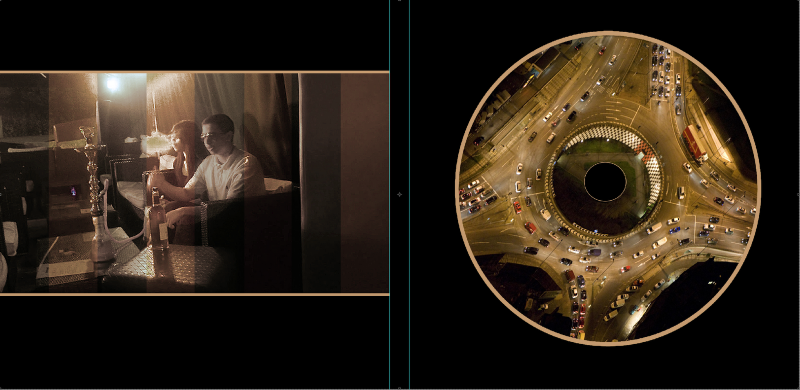
For my inside panels of my digipak, I keep the consistency with edits, which most album art have, however where I challenged the conventions is where my CD holster, I didn't just leave it blank or plane or dull, I thought personally this was a great opportunity to ad a vital image which would contribute to my artists overall profile, I kept the consistency of them, of a busy city.
 The advert consisted of the same font from the album cover and I wanted to keep it consistent and I wanted to keep the background black so it would be a clear contrast and it would stand out which is the initial purpose. I made the image of the artist the centre of attention and kept the text formation simple because I wanted to to deliver the message and be attention grabbing rather than confusing and hard to read and make sense of everything. I followed the rules of thirds, making sure the image was in the right position.
No comments:
Post a Comment