Thursday, 19 January 2012

Q3 - How did you use media technologies in the construction and research, planning and evaluation stages?


This is a slideshow of all the equipment and technology that was used, from start to finish, of our music video. Below, is a video that has me demonstrating and presenting each piece of equipment; commenting on the use and when it came handy.


Above is a video of me, showing and demonstrating the equipment we used. Along with, when
it came in handy and the most use, during the Music Video construction process.


This is a slideshow, dedicated to the different kinds of software and programs we used, throughout the whole process of the A2 Media Coursework!

Q2 - How effective is the combination of your main product (video) and ancillary texts (digipak and advertisement) ?


Here, I am pointing out the clear visual links between my ancillary
products, with my Music video, as I'm being interviewed by my collegues.
I collected a few questions, surrounding the issues and opinions, people, who I
considered to be my target audience had with my work.


Here, I am responding towards the question of
whether there was a complication of trying, to promote
too many personalities of Rhyme Royale. Which, as a result,
could potentially confuse the target audience, that I intended to attract.


Monday, 16 January 2012

Q4 - What have you learned from your audience feedback ?


Evaluation: Question 3

How did you use media technologies in the construction and research, planning and evaluation stages?

First of all the equipment that we used, we are not strangers to them we have used them before in AS.

BLOGGER

As much as i love to blog (you can tell by how many blogs i have done), blogger is one of the key media technology that is used. Anything that is done with other media technologies we had to refer back to blogger. Blogger was used to plan, to construct and to publish our music video. We started research by asking for copyright for music videos that we thought would suit our group, then find and concentrate on other music video who would relate to our genre. Looking back we also had to think about what to include in our music video and learn terms like "male-gaze". Planning we made our storyboard and constructed our music video through mind and appeared in blogger, the magic did not stop there we witnessed our music video be created in baby steps.

CAMERA EQUIPMENT+MEMORY CARD


INTERNET + MACs


video refrence to Question 1

Each video is explained through voice-over


 westside connection- Gangsta Nation ft Nate Dogg R.I.P. From this track costume was influenced because the concept of this music video is similar to ours. The idea of a "journey" to a rich life and being on top.
Lil jon - what you gonna do ft Eastside boyz, Lil scrappy.
This track influenced our idea on the split screen between the artist, showing two of the same artist in a "rap battle". Also, showing two different stages of Rhyme Royale carer being one  is rapper "straight from the hood" and the other been  more of "part animal".

Thursday, 12 January 2012

Q1 - In what ways does your media product use, develop or challenge forms and conventions of real media products ?

Andrew Goodwin's theory of illustrative, amplifying, contradicting lyrics.


In our video, some of our lyrics had explicit references to objects. In this case and many other RnB videos, it's to do with activities related to alcohol and women. The song had a few lyrics, inwhich, I believed we could either illustrate, amplify or contradict. I had extracted clips from our video and explained what lyric and what form of relationship it had with the action from the video.


Artist looking directly look into the camera


Camera Movements and other Influences


This is Drake, 'Headlines', we took the idea of the dining scene,
with Drake smoking and drinking alcohol. This suggesting he is a don,
and has people power and men under his influence and authority. We wanted
to portray this same aspect in our video, with our dining scene.

The Banquet Scene In Drake's Video 'Headlines'

The Banquet Scene in Rhyme Royale's Video


Champagne and Alcohol


This is from Dolla's music video, 'Make a Toast',
we took the idea of having a champagne/alcohol 
bottle. As this seems to be conventional, in most RnB 
videos. In addition, We took the scene of the 'toast', itself,
suggesting that Rhyme Royale has people power and authority.

The slideshows below, show the ideas that we took from Dolla's music video and that we took into 
consideration. The first one, is about the toast and the man power he controls and the second, he shows the empathy of alcohol in his video.


Edits and Women representation theory of Laura Mulvey


In Drake's video, 'Money to Blow'. We took the
idea of using one of the split screen edits, as we thought
it was a great way of putting empathy on Rhyme Royale,
as well, as the objects associated around him, i.e. women. We
considered Laura Mulvey's theory of representation, of females
in music videos. We wanted to make women look like a desire
and an object to Rhyme Royale and the male audience, who can
relate to him.

Here is the split scene screen applied to our video
, if applied to Laura Mulvey's theory of representation. We wanted to show
women as a sexual desire of the male audience. Hence, specific focus was
placed on part of their bodies.


Smoke, Smoke and blow it away...


This is Wiz Khalifa's, 'On My Level'. We took the
idea of the smoke being reversed in to the mouth. As
most of our music video was being filmed in a Shisha
lounge, so we thought it could be a nice touch. In addition,
it looks quite menacing and we wanted to show that Rhyme
Royale is a bad boy and a rebel - which seems to attract female attention,
in RnB music videos. Here below, I lined up some images from my video,
of Rhyme Royale and his female accomplice smoking, to portray this rebel
representation. It seems like the idea of drug use is a effective portrayal of
that 'Rebel image'.


The City and Establishing Shot


This is Wiz Khalifa, 'Say Yeah'. We liked the start of the video
of how it introduced itself, with the cityscape, with the artist and
track name, floating with it. So we chose fonts that suited our genre,
and imported it on to our establishing shot of Canary Wharf.

This is the opening shot to our music video, as you can clearly
see we took influence of the text and the same camera movement,
conducted from the Say yeah video. We thought it would be a classy way
to begin the music video.


The Filters we used

We applied a filter with a light and amplified with
Final Cut Pro.
This is Belly - Purple Drugs, we wanted to take the
filter of the shots made. 


This is Usher - Yeah, the blue filter, gives off that cool feeling,
along with the idea of everybody is all in the same feeling, as
they're in a party.

This is Drake - Marvins room, the filter used gives the feeling
of surrealness and hazyness.


The filters gave off an intensified effect, as it is common in all videos. In Belly - Purple Drugs, it gives off that feeling of being lost and mystery (connotations associated with the purple). Our Burgundy and red filter, gave off that feeling of sexual tension and heat in our video.


Ancillary Products


This is the front panels of the Digipak, as you can see that the city of London
is evident within the songs. As the song we did was called, 'Its my City'.
I researched some artists from London and checked out their Digipaks and
could see that London skyline was used, with effects to satisfy what kind of
feel that they wanted to put out.

With K Koke, that feel was a smokey and gritty London. Whereas,
in our Digipak, we wanted London to look stunning and shimmery.
However, our genre was not to do with Gangster Rap or Grime. So we
altered the city to portray that it as a place to be, with the night life. Not
somewhere that is associated with Estates and Ghettos.

This is another piece of album art, inwhich, I developed my Digipak
and poster upon. Ne-Yo is an RnB artist, just like Ryhme Royale, as
you can see the image of the album is taken at night, which demonstrates,
something about a City's night life. However, I did not want to portray Rhyme
Royale as a formality, as that was not specifically, his target audience. Hence, he
wore casual and items, that his target audience desire, such as Beats Headphones and
Biker jackets etc. Therefore, I can say I managed to fuse the two aspects of album art,
from Grime and RnB together.
However, during our video, the filming took place a little early prior to
sundown, as I was looking for that darkness to come through. This
could contradict the whole concept of promoting the night life aspect in RnB
videos. On the other hand, the white sky, could connote the idea of rising

This is the advertisement poster, once again. I stuck with the
blue theme throughout, so the ancillary products were consistent.
I followed the conventions you would find on an advertising poster, for
a music artist. I referenced specialist RnB magazines, to give their ratings and
comments upon him, as the audience would get the assumption, that he is a talented artist.

I placed the iTunes and HMV in the poster, to show how easy it would be for his target audience,
to get hold of his music. As millions of people use iTunes and for those who would like to get hold
of his album, they could go in to a store and purchase it.

Also, I added the social networks that Rhyme Royale is connected to, which is the three major social
networks, this tells his audience, that he is easy to connect to and communicate with.


This is the inside panel of my Digipak, I followed the convention of keeping
a filter and theme consistent throughout the Digipak. I tend to notice that
blue had a consistent upbringing in other Digipaks, such as, the one below of
Pitbull - Planet Pit.
The blue theme here is what we utilised in our Digipak, as
we believed that this was the colour of our genre of RnB. This
is Pitbull's Planet Pit album, however, we challenged the apsect
of his face being merged in to the woman. As we thought, it would give off
the idea that Rhyme Royale is just a ladies man, which he is but we also wanted
the album to be about him and his city.


q1

In what ways does your media product use, develop or challenge forms and conventions of real media products?


This screen grab is taken from the the music video "Drake - Headlines" this is the iconic scenes within the music video, this frame shows a group of Drake's friends around a table, drinking wine and on a very luxurious looking background and props. We also in our music video used this technique to present our artist to be rich and successful and did the same thing.

One of the theories we used to assure we had features assured for a good pop music video is the direct contact with the main artist looking exactly in the camera. we also had a series of edits of the artist, we had angles of our artist, this was done as much to the beat, this is following Carole Vernails theory that music videos have more frequent edits on the beat.
Whilst planning out music video, we as a group decided we wanted to show the transition of our artist going through a street artist look to a very established rich look, however we took in consideration Andrew Goodwin's theory about lack of traditional narrative in pop music videos. 


In the video "Drake - Forever", we used the scene where Lil wayne is rapping, however the whole scene is almost tinted in a red light, to grab attention and emphasise being almost like being in VIP club style atmosphere.


This is a shot of our artist playing pool. We tried to present power by him being the centre of attention just like Dolla in his music video.


My inspiration for my ancillary work from a range of artist and researching the connotations of fonts and colours which would give my artist the correct profile what we have created for him.
This is the drake "Take care" Album, drake is a rap artist, usually associated with his grand wealth, his celebrity rapper friends such as Lil wayne. This album has a colour scheme of gold and bronze, a sign of wealth and power. This is what I wanted to have on my album cover to have a similar effect. So took a similar approach on front colour.


Whilst looking for inspiration for my ancillary work (digipak), I wanted to do something innovative, and slightly different to what R&B album art formation would have, so I took inspiration from the "The hold steady" album art. I took the text formation on the back of the digipak. It allowed me to not destroy the actual background of the digipak by taking minimal space, and looking clutter free and it's different and this is how I challenged the convention of a R&B digipak format.

This is my back panel, it obviously varies from my original plan, when doing the pitch to the class. I realised that many people where adding some kind of effects or visual effect to make it stand out, so I start playing around with this background adding and reducing tint, temperature and all the works. Then it came to me if I had almost had this panel effect added, so I changed the original background colour, and then copy pasted the original image on top, and divided them.


And what this allowed me to do is follow some conventions such as keeping this Golden outline which connotes a sense of wealth and quality which I want to be associated with my artist, this is what drake done. I also wanted the visual effects and the bright city to grab the attention rather than the artists face, to promote the kind of music he would be playing and the kind of character he is from first glance. 


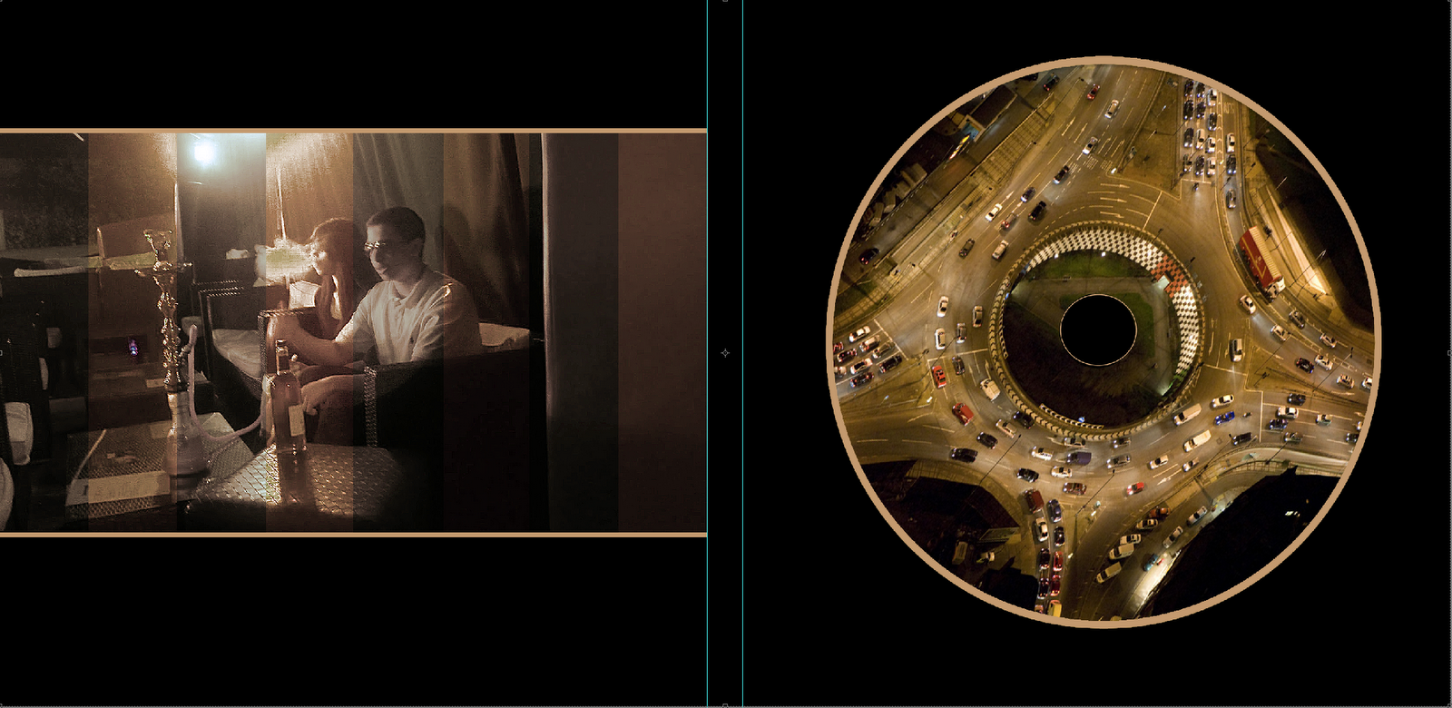
For my inside panels of my digipak, I keep the consistency with edits, which most album art have, however where I challenged the conventions is where my CD holster, I didn't just leave it blank or plane or dull, I thought personally this was a great opportunity to ad a vital image which would contribute to my artists overall profile, I kept the consistency of them, of a busy city.


The advert consisted of the same font from the album cover and I wanted to keep it consistent and I wanted to keep the background black so it would be a clear contrast and it would stand out which is the initial purpose. I made the image of the artist the centre of attention and kept the text formation simple because I wanted to to deliver the message and be attention grabbing rather than confusing and hard to read and make sense of everything. I followed the rules of thirds, making sure the image was in the right position.